
This is a map I created in ArcMap 10.4 in which I used Network Analysis tools to create a 5 minute service area analysis for a given location (the local Safeway supermarket) in Alamo, CA. The service area parameters are a 5 minute drive-time on 35 mph roads with no other restrictions. The map also shows address locations for about 270 addresses in the city limits that was created using ArcMap’s Geo-Location tools.
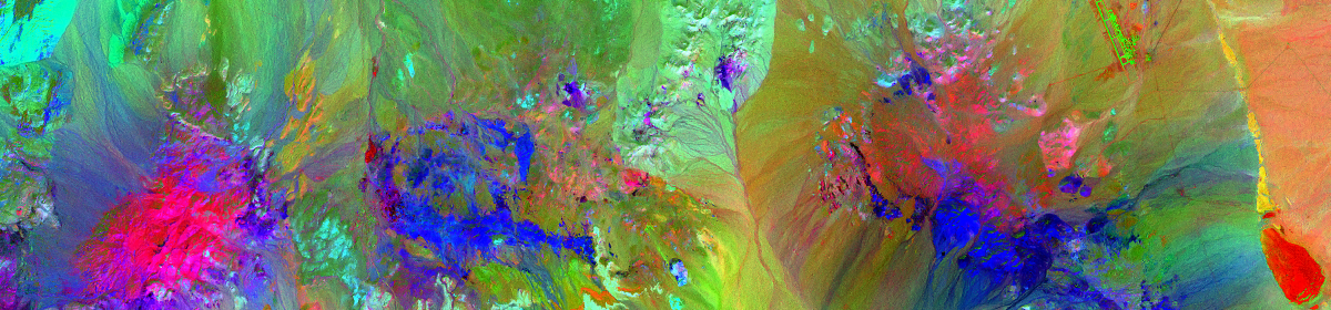
ENVI RGB + Band 7 IR

This is an RGB + shortwave IR image (Band 7) from Landsat 8 over the Diablo Valley, in the San Francisco East-bay area. Processed using Harris Geospatial’s ENVI 5.3
ENVI Image Classification


Unsupervised Classification

Supervised Classification
These are examples of image classification in ENVI. On the left is ENVI’s automated (“unsupervised”) classification and on the right is a manual (“supervised”) classification. ENVI’s automated classification is very good. It’s quick and easy to get good results – these results could be even better had I fine-tuned the settings a bit, but in this case I just ran the default settings (with the exception of iterations – the default is 1, I ran 6). The whole process took about 2 minutes. The image on the right is the result of manually selected classifications. This approach allows a lot more control and given time, a skilled analyst could generate very accurate classifications. These results are after about 10-15 minutes of selections and include a few areas that are better classified than in the automated process, for example the bright red spot at about 300° below and to the right of center is a burn-area that the automated process did not pick up.
432 (or Technicolor Hurl)

This is bands 4, 3 & 2 from a multi-spectral aerial image of a portion of the Nevada desert. Created in ENVI 5.3 – I think it’s pretty 🙂
ENVI SPEAR NDVI

This image shows plant vigor, with darkest green representing healthiest vegetation. Generated from Harris Geospatial’s ENVI 5.3, using their “SPEAR” (Spectral Processing Exploitation and Analysis Resource) tool from a Landsat 8 image of a portion of Contra Costa County, CA.
Mount Shasta, Improved DEM

In this map I’ve applied a Low-Pass filter to remove unwanted noise from a hillshade of a DEM of Mount Shasta and then used Map Algebra in the Raster Calculator to combine the filtered hillshade with an unfiltered hillshade to replace areas where detail was lost. I then applied and fine-tuned a stretched symbology treatment to give the impression of a snow-capped peak.
Wildfire Risk Analysis

Increased risk for wildfire is associated with West, Southwest & South facing landscapes with slopes of 60 percent or greater. Starting with a USGS 7.5 minute DEM, I applied Hillshade and Aspect analyses and used Raster Calculator conditional statements to isolate the areas that matched the risk factors. This map shows those slopes that match one or both risk factors.
Viewshed Analysis

This is a viewshed analysis for 4 proposed cellular antenna tower locations in Walnut Creek, CA. Individual tower viewsheds can be seen in the main map area and total viewshed area for all 4 locations is shown in the inset. Basemap is a USGS 7.5 minute Digital Elevation Model with Hillshade.
Contour Lines

This is a before and after of a very small TIN model, plus contour lines and elevations I did in Adobe Illustrator. The cluster of elevations was given and I laid out the triangles, contour lines and elevation labels in Illustrator CC 2017.

Before

After
ArcGIS.Com storymap – Micro-climates in the San Francisco Bay Area

Link to map: http://arcg.is/2hngpiH — I created this storymap using ArcGIS Pro and ArcGIS.com with some assets hosted on Amazon’s AWS S3. This is actually 2 storymaps in one – the time-aware map on the right is nested into the parent shell that provided the section links on the left. This map shows changes in temperature, precipitation, wind-speed and wind-direction at 9 different weather stations in the San Francisco Bay Area over a 13 month period from September 1, 2014 to September 30, 2015.